


Discover Our Popular Courses
Find Usa Online Courses at Shopwebly, the Website to Compare Prices! Find and Compare Usa Online Courses Online.
Save Now at Shopwebly! Compare Products. Many Products. Easy Acces.
Search and Discover.
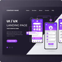
Fundamental Of UI/UX Design
E-Learning is one of the world's largest platforms for free online
Price : 20$

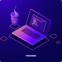
Javascript Basic to advanced
E-Learning is one of the world's largest platforms for free online
Price : 20$
Fullstack Web Development
E-Learning is one of the world's largest platforms for free online
Price : 20$

Digital Marketing
E-Learning is one of the world's largest platforms for free online
Price : 20$

Photography Basic Rules
E-Learning is one of the world's largest platforms for free online
Price : 20$
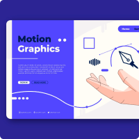
Motion Graphics
E-Learning is one of the world's largest platforms for free online
Price : 20$

Explore The elearning Institute
There are many variations of passages of Lorem Ipsum available, but the majority have suffered alteration in some form, by injected humour, or randomised words which don't look even slightly believable. If you are going to use a passage of Lorem Ipsum, you need to be sure
3.2K+
Online Course
600+
Expert member
1k+
Rating & Review
Ready to join?
It is a long established fact that a reader will be distracted by the readable content of a page when looking at its layout.
Meet Our Successfull Students
There are some susscessfull student who are now successfull in there life.Now they are enjoying there work very much.

Awlad Hossain
UIUX Designer

Jannatul Islam
Motion Design

Imran Hossain
Graphic Designer

Nishi Akter
Web Developer
Awlad Hossain
App Designer
Jannatul Islam
Graphic Designer
Frequently Asked Questions
It is a long established fact that a reader will be distracted by the readable content of a page when looking at its layout.
The basic difference between CSS Grid Layout and CSS Flexbox Layout is that flexbox was designed for layout in one dimension - either a row or a column. Grid was designed for two-dimensional layout - rows, and columns at the same time. The two specifications share some common features, however, and if you have already learned how to use flexbox, the similarities should help you get to grips with Grid.
Bootstrap comes with a set of pre-styled responsive, mobile-first components that possess a definite UI kit. Tailwind CSS uses a set of utility classes to create a neat UI with more flexibility and uniqueness. Sites created using Bootstrap follow the generic pattern that makes them look identical.The significant difference between Tailwind CSS and Bootstrap is that Tailwind offers predesigned widgets to build a site from scratch with fast UI development, while Bootstrap comes with a set of pre-styled responsive, mobile-first components that possess a definite UI kit.
In CSS, the term "box model" is used when talking about design and layout. The CSS box model is essentially a box that wraps around every HTML element.The CSS box model is a container that contains multiple properties including borders, margin, padding, and the content itself. It is used to create the design and layout of web pages. It can be used as a toolkit for customizing the layout of different elements. The web browser renders every element as a rectangular box according to the CSS box model.
The HTML semantics refers to the tags that provide meaning to an HTML page rather than just presentation.It makes HTML more comprehensible by better defining the different sections and layout of web pages.A semantic element clearly describes its meaning to both the browser and the developer.By adding semantic tags to your document, you provide additional information about that document, which aids in communication. Specifically, semantic tags make it clear to the browser what the meaning of a page and its content is.
Trusted by over 800+ companies